What I did
- Method: self-testing the real product end to end, combined with community sentiment analysis across Reddit, GitHub issues and YouTube reviews (2025–2026) to separate my own friction from recurring, evidenced pain.
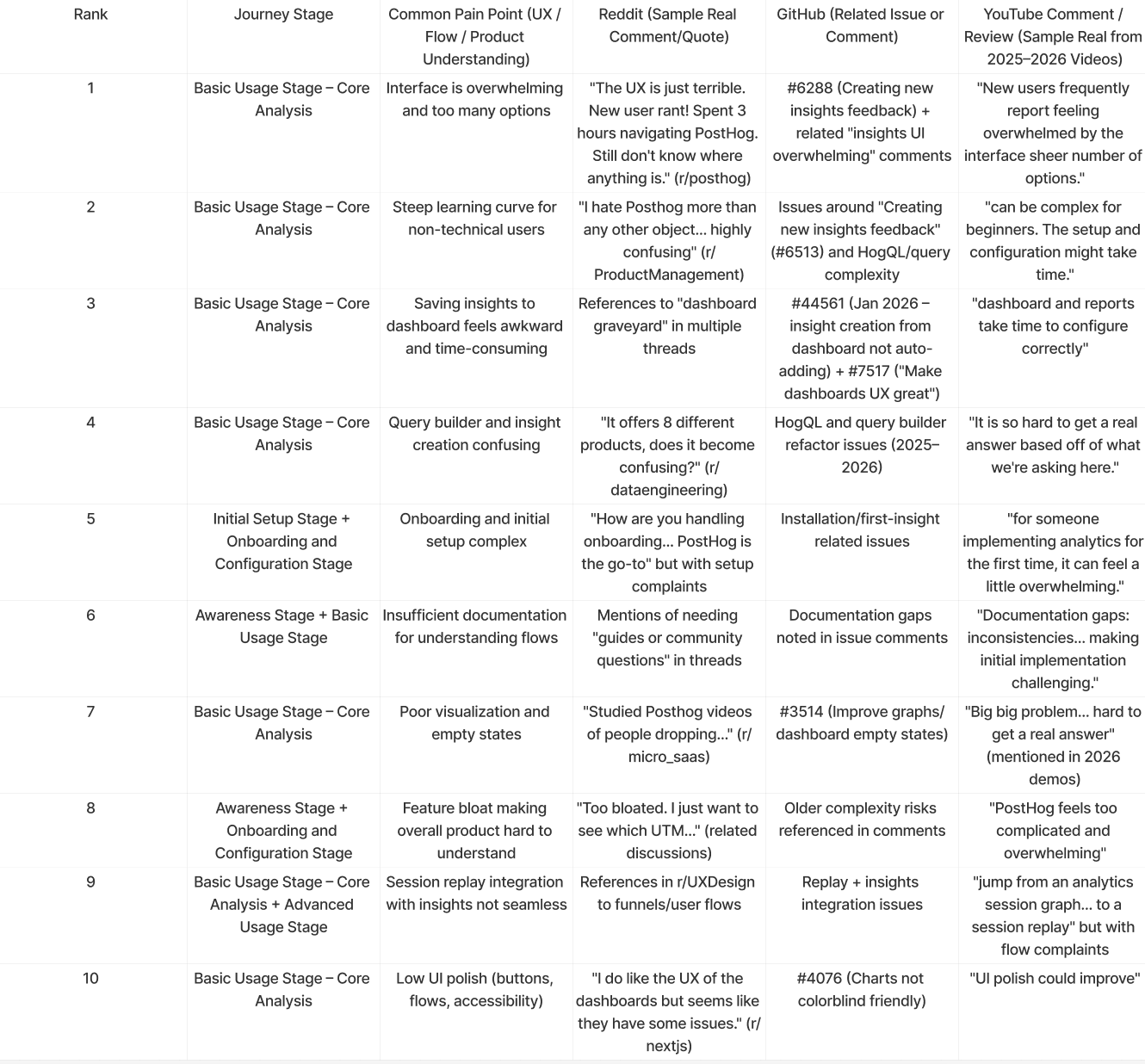
- Evidence matrix: mapped the ten most common pain points to the journey stage where they appear, each one triangulated against a real user quote, a related GitHub issue and a public review comment — so no recommendation rests on a single opinion.
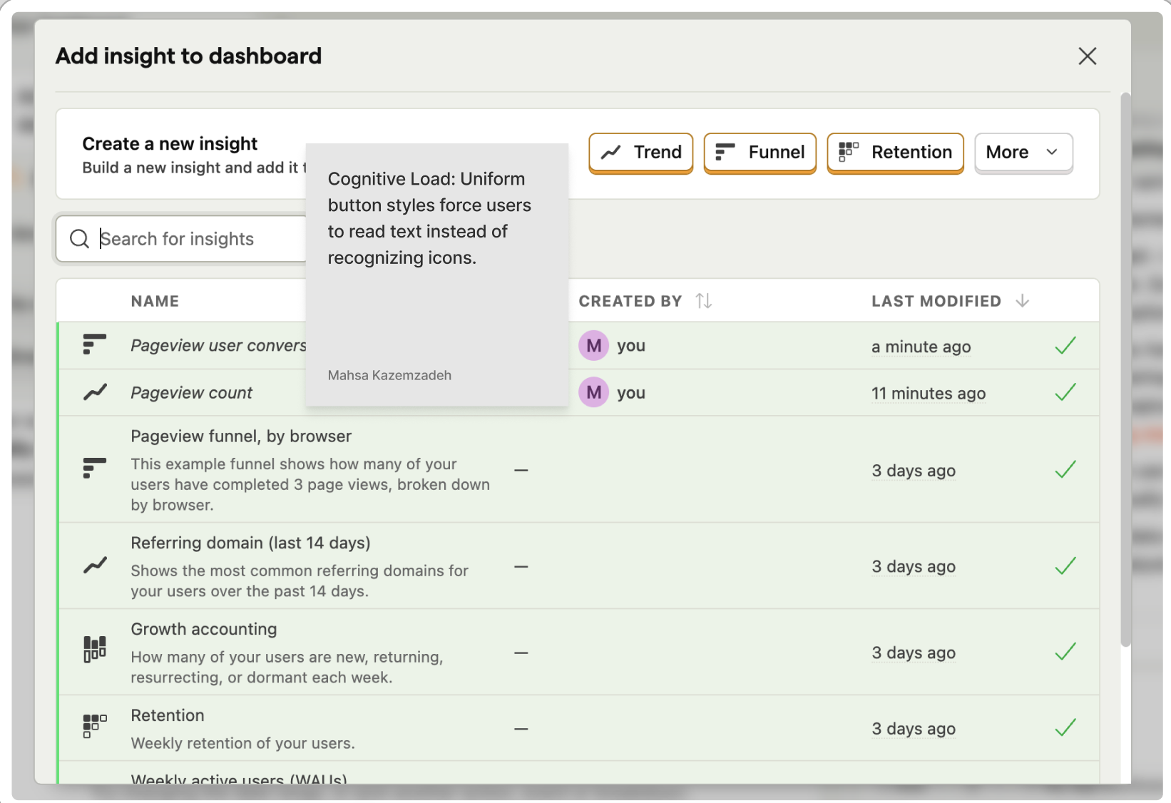
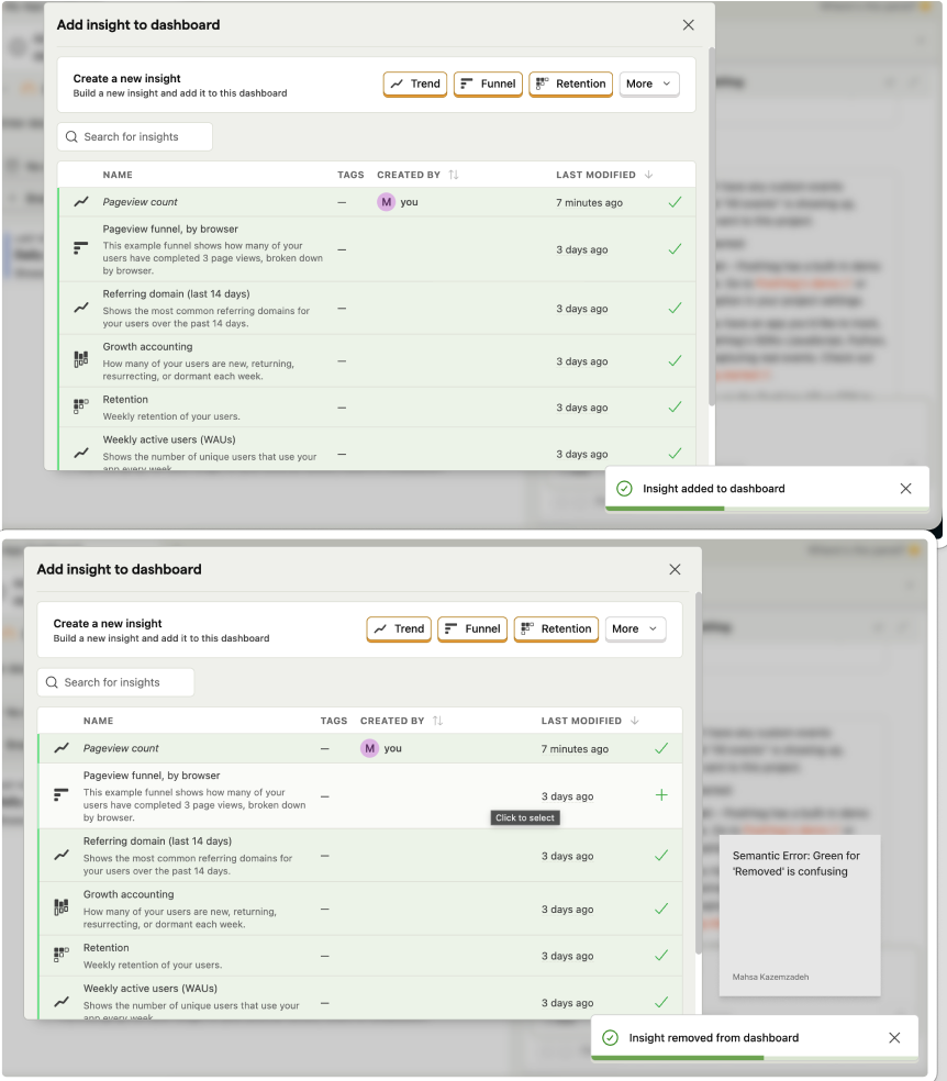
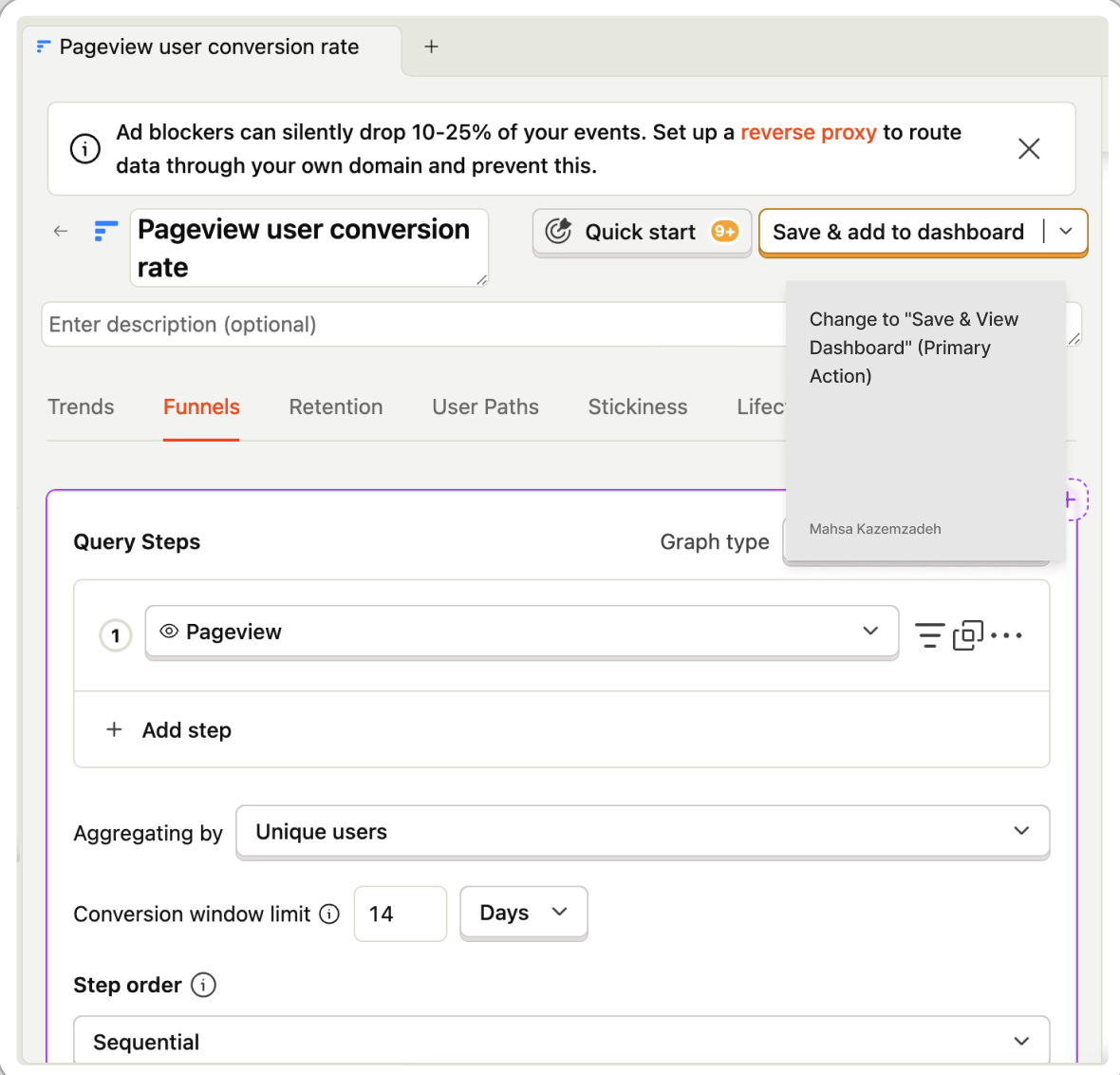
- Diagnosis: ambiguous feedback (no redirect after saving, plus green toasts used for both "added" and "removed"), high interaction cost in saving and viewing an insight, low visual affordance across Trend/Funnel/Retention buttons, and passive empty states that dead-end new users.
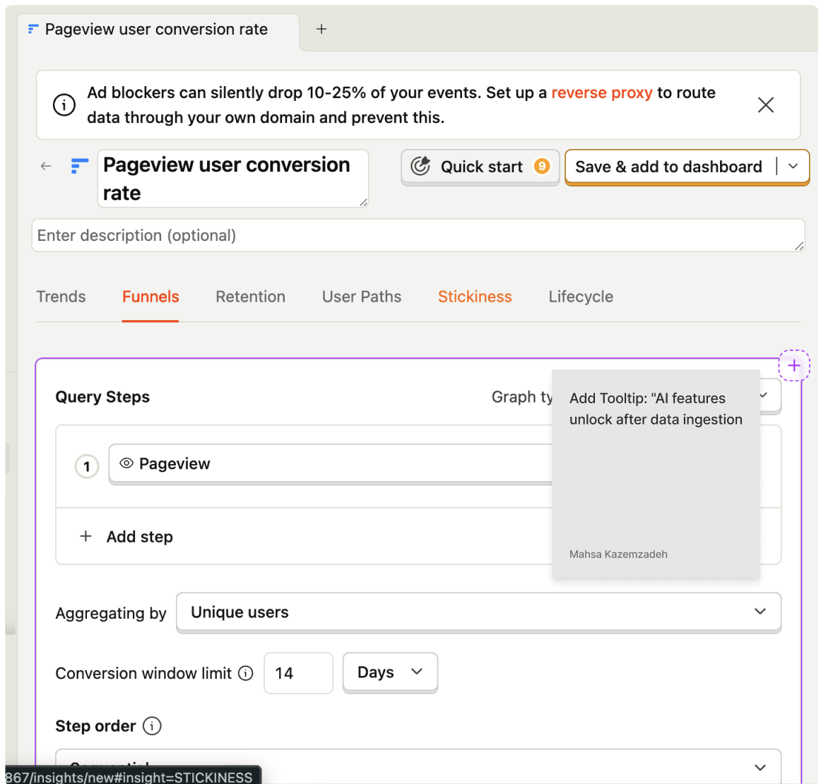
- Proposals: a "Save & View" split button that saves and redirects to the destination dashboard, semantic toast colours for destructive actions, unique icons and subtle brand colour per insight type, actionable Quick Start templates inside empty dashboards, and mini-sparkline previews in the "Add to dashboard" modal.
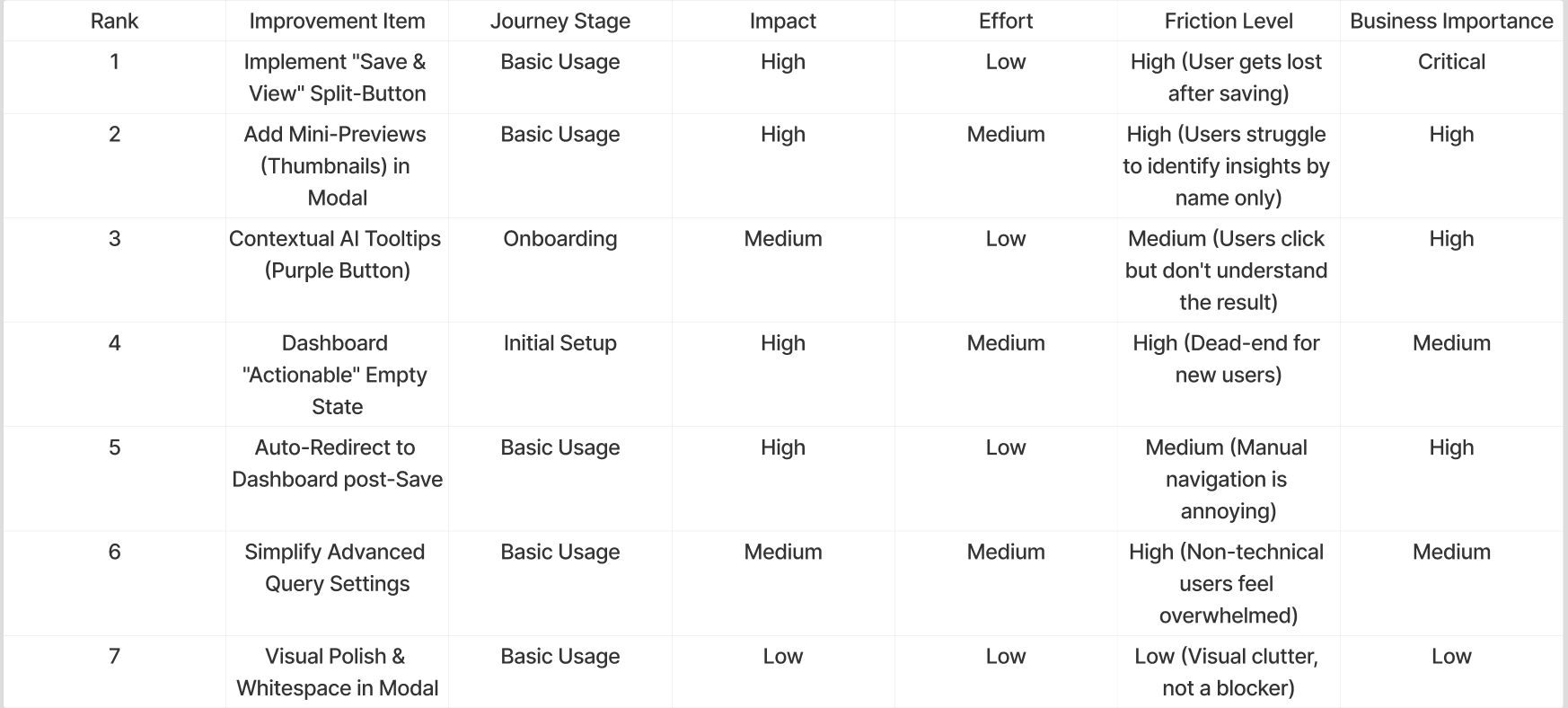
- Prioritisation: ranked every item by impact, effort, friction level and business importance, which let me argue against a full UI redesign and for a small set of high-ratio changes an engineering team could ship incrementally.
- Communication: filed the audit as a public GitHub enhancement issue in PostHog's own language and templates, with annotated screens and a FigJam board so the team could review the reasoning rather than just the visuals.
Inside the product
pain-point-matrix.png
add-insight-modal.png
toast-semantics.png
annotated-flow-1.png
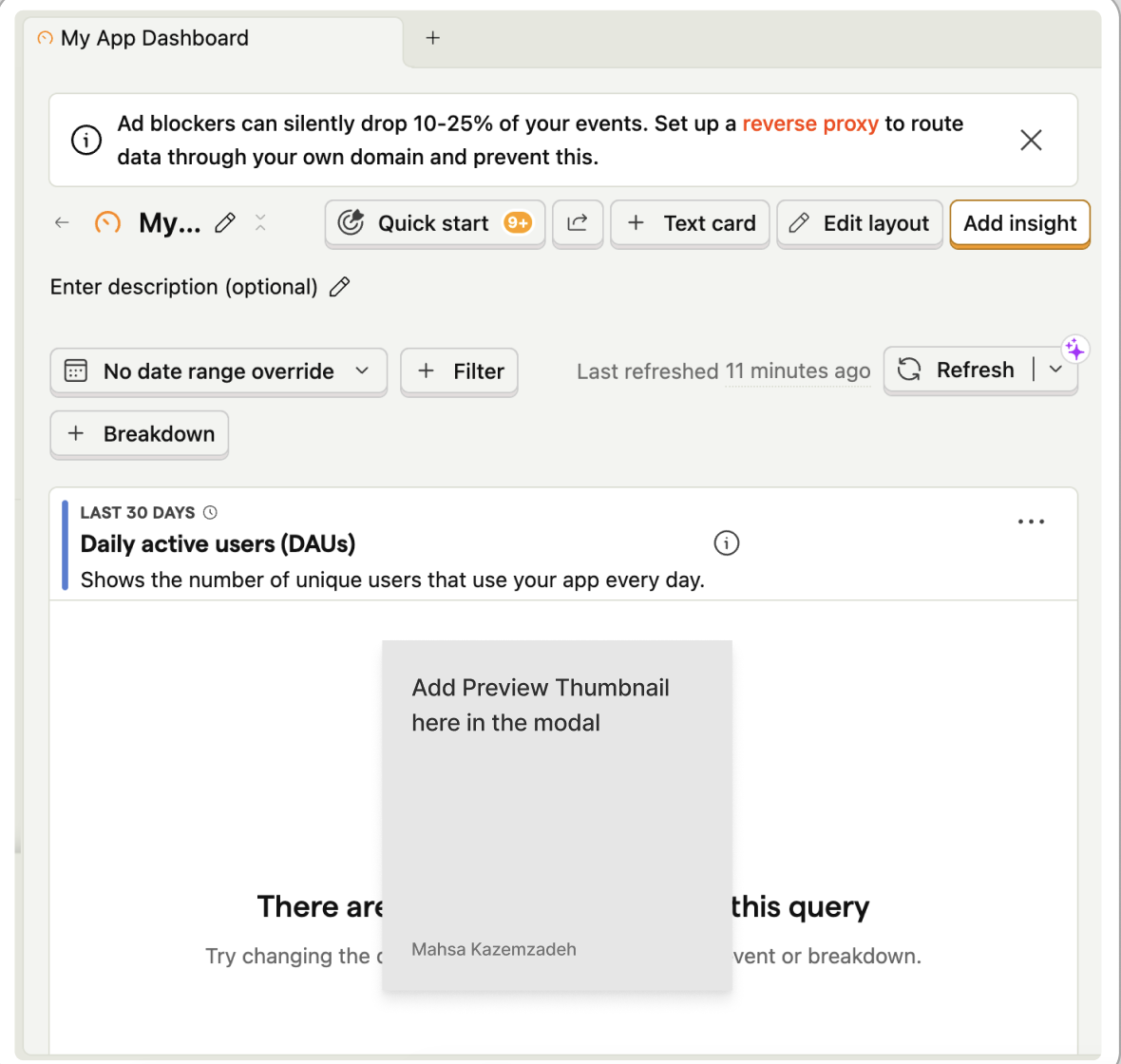
annotated-flow-2.png
annotated-flow-3.png
impact-effort-matrix.png
project-note.txt
This page is deliberately short-form — quick to read, linked to the real thing. When a piece of work deserves full context, challenge, findings and reflection, it lives in the case studies instead.