The Business Mandate
- Role: UX Researcher & Experimentation Manager
- Domain: FMCG E-commerce
- Core Focus: Mixed-Methods Research, Continuous Metric Optimization, Product Discovery
- Duration: 6 Months
- Platform Scale: 3M+ active users
Okala, as a pioneer of FMCG e-commerce in Iran, had reached a structural inflection point. The original design was no longer a foundation, it had become a ceiling.
Two constraints were actively blocking growth:
- The Growth Barrier: The legacy architecture had hard limitations in product categorisation, variety display, and feature scalability. Most critically, it was preventing the launch of entirely new product lines, a direct constraint on the business's next phase of growth.
- The Technical Headwind: Underlying development frameworks were restricting engineering velocity, making even incremental improvements slow and expensive.
This redesign wasn't initiated by a UX audit. It was a business imperative, executed across three distinct phases requiring tight alignment across Product, Development, and Design.
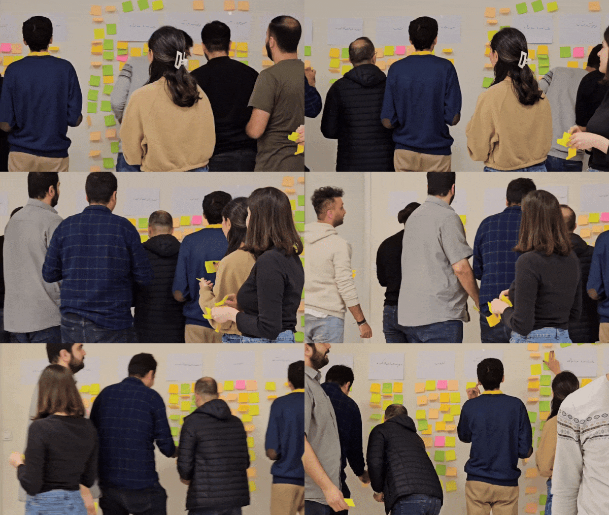
This is where my role began. I was the sole researcher on this project, but in practice the role operated at two levels simultaneously. At the execution level, I owned the full research lifecycle: study design, recruitment, facilitation, analysis, and synthesis. At the coordination level, I functioned as the de facto research program lead for a cross-functional team spanning Product, Design, Development, Data, Marketing, and Growth, defining the research agenda, presenting findings to senior stakeholders including the Head of Design and Head of Research, and ensuring no major product decision moved forward without an evidential basis.
This dual responsibility shaped everything about how I designed the framework that followed.

The Research Challenge
At 3M+ active users, subjective design opinion wasn't an option. But standard A/B testing alone was also insufficient: with a full-platform migration live, waiting for A/B results meant thousands of users experiencing problems before we knew they existed.
What the team needed was a system that could capture behavioral signals continuously, explain the why behind quantitative anomalies, not just surface them, and feed directly into sprint decisions rather than sitting in a document.
Before each research cycle, I defined explicit questions to frame what we were trying to learn, not just what we were trying to measure. In the basket and checkout phase, for example:
- Where in the purchase journey are users losing confidence, and what's causing it?
- Are drop-offs driven by UX friction, information gaps, or expectation mismatches?
- Which behavioral patterns from the old design are users carrying into the new experience?
These questions determined which methods to deploy in combination, and ensured findings arrived as decisions, not observations.
The Operational Framework
I took an existing research framework as a foundation and re-engineered it for our team's sprint cadence and cross-functional structure. The result was the Operational Framework for Design Monitoring and Iteration, a seven-stage continuous cycle that embedded research directly into how the team built and shipped.
Three principles made this different from standard practice:
- Embedded, not episodic: research outputs fed into sprint planning every two weeks, not quarterly
- Mixed-signal by design: funnel data, Hotjar heatmaps, and usability sessions were read together, not in isolation
- Decision-ready: every insight arrived mapped to a KR and a prioritised recommended action
1. Defining the Terrain
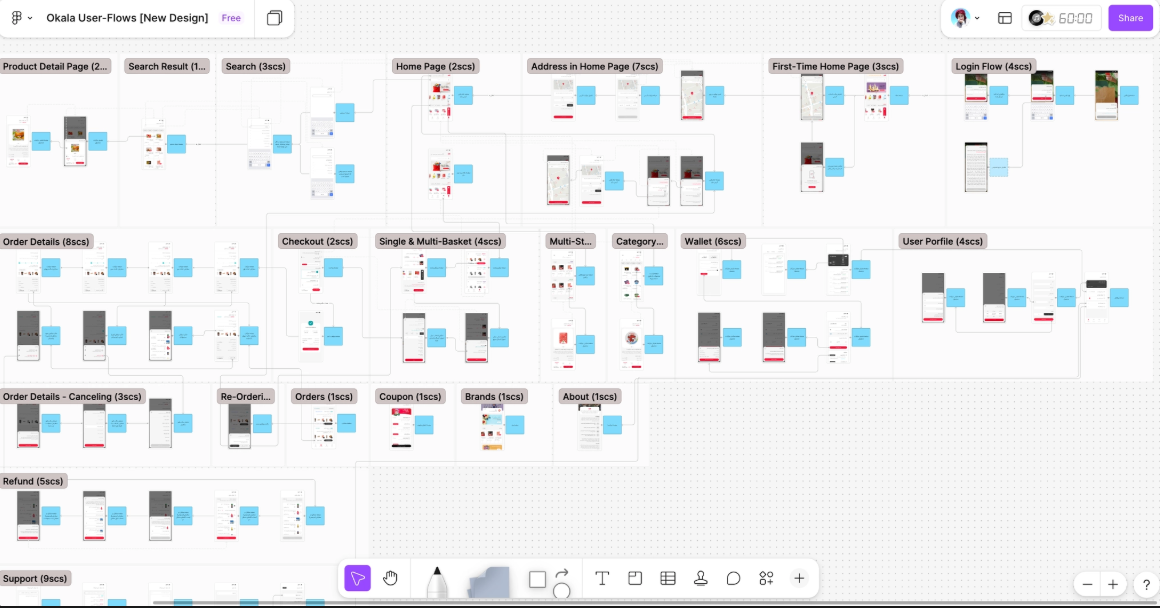
Updated User Journeys and User Flows were mapped across every section of the product, explicitly documenting Pain Points and required design changes. This became the shared source of truth for Product, Design, and Engineering before a single design decision was made.
2. Establishing the Baseline
A comprehensive data audit: latest product research synthesis, final funnel review in Google Analytics, and full Hotjar heatmap analysis, establishing a clear behavioral baseline against which all post-launch changes would be measured.
3. Cross-Functional Synchronisation
I facilitated structured collaboration between Data, Development, Product, and Marketing teams to ensure behavioral shifts were visible in real time, not discovered retrospectively.
4. Targeted Vigilance
The highest-sensitivity flows were identified — checkout, basket, home page navigation, search — with dedicated data streams established for continuous monitoring of these areas specifically.
5. Rhythmic Research
A disciplined cadence: bi-weekly deep dives for high-sensitivity sections, monthly reviews for secondary areas, keeping the feedback loop continuous without overwhelming the team's capacity.
6. The Engine of Insight
All signals converged into bi-weekly Product Discovery sessions, structured reviews where findings were presented, debated, and translated into decisions collaboratively with stakeholders, Design, and Development. Nothing significant moved without this loop.
7. Final Validation
Each section was tested before full release: usability testing at key milestones, followed by detailed behavioral documentation and Conversion Rate analysis for each implemented feature.
The Evidence Base
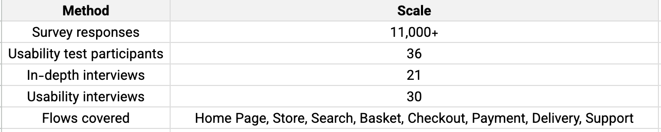
The framework was backed by substantial mixed-methods research built continuously across the full project lifecycle, not a single test round, but a compounding evidence base:
Why this combination of methods?
Survey data told us what was happening at scale, it couldn't explain why. When surveys flagged high cart abandonment rates, that was the signal. Usability sessions with 36 participants gave us the mechanism: users weren't abandoning because they changed their minds, they were abandoning because critical information wasn't surfaced at the right moment in the flow.
The two methods were deliberately triangulated:
Surveys to prioritise where to look, usability to understand what was actually happening there.
Participants were recruited from Okala's active user base, stratified by purchase frequency — weekly buyers, monthly buyers, and recently lapsed users. Interview participants were selected to include both power users and users who had experienced specific friction points, identified through Hotjar recordings and support ticket analysis.
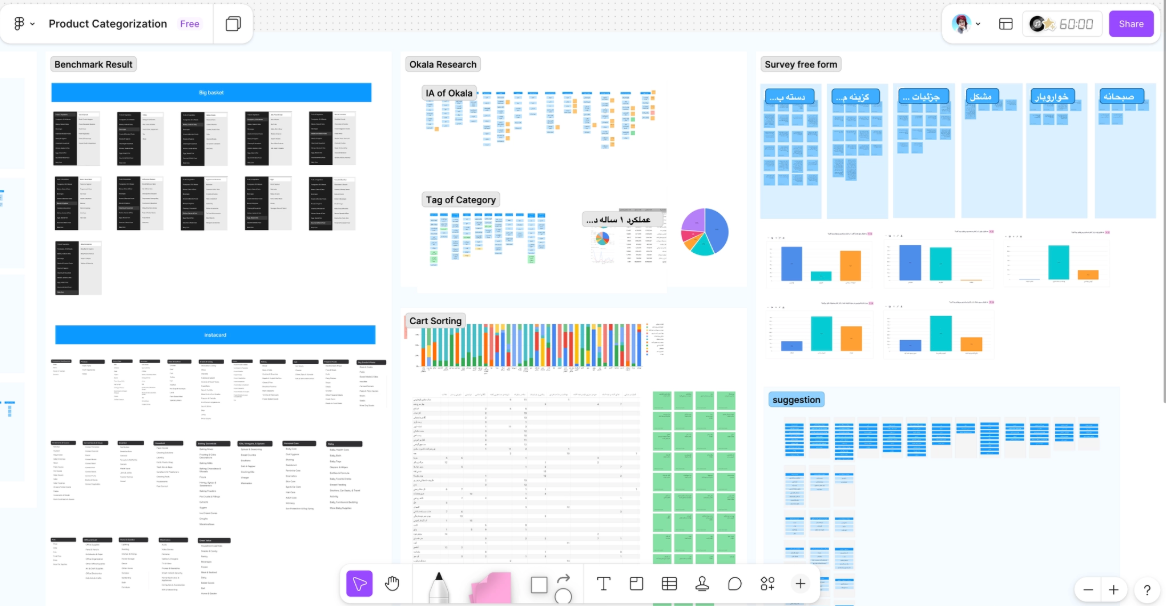
- User Flow Maps, FigJam
- Information Architecture Diagram
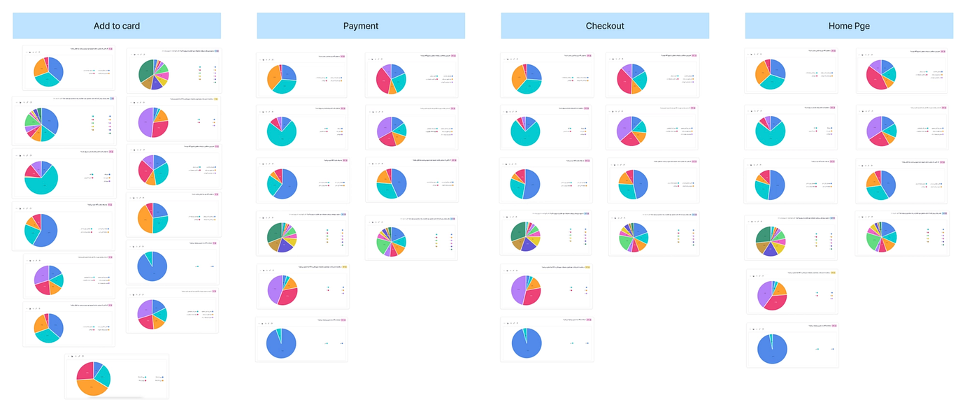
- Behavioral Analysis Charts: Add to Cart / Payment / Checkout / Home Page
- ATC Source Analysis, Android & Web
What the Data Didn't Always Agree On
Data sources didn't always align, and those moments of conflict were often the most instructive.
In the search and category research, survey responses suggested users were broadly satisfied with product findability. Usability testing told a different story: 43% of participants struggled to locate target products, and the root cause wasn't search functionality, it was category labelling. Users didn't report findability as a problem in surveys because they had adapted. They had developed workarounds — browsing Otyme, scrolling carousels — that masked the friction entirely.
Self-reported data reflects how users think they behave; observational data reflects how they actually behave. When the two conflict, observed behavior takes precedence.
Three Findings That Shaped the Redesign
These weren't post-launch observations. Each was identified through the research cycle, evidenced across multiple methods, and acted on before reaching the full user base.
Finding 1 — Delivery Window: A Silent Abandonment Driver
In usability testing, 8 of 36 participants abandoned their basket without realising the delivery window was full, the explanation was positioned at the bottom of the screen and consistently missed. Hotjar session recordings confirmed the pattern at scale.
The downstream impact was significant: 63% of affected users switched to a competitor store. Survey data reinforced this — product availability and delivery window clarity were among the top reasons users cited for not completing orders.
Direct outcome: Delivery window availability was redesigned to surface earlier and more prominently in the purchase flow, before product selection rather than after.
Finding 2 — Discount Code Flow: Friction at the Moment of Commitment
34 of 36 usability participants encountered friction at the discount code step — they were required to navigate back to the Home Page to retrieve their code, breaking the checkout flow mid-session. 23% abandoned the journey entirely at this point. 9% became lost in the flow attempting to return. Hotjar recordings corroborated this, showing repeated back-navigation patterns immediately before drop-off.
Direct outcome: The discount code flow was redesigned to be accessible within the checkout context, eliminating the navigation break entirely.
Finding 3 — Search & Category Findability: A Structural Problem
43% of usability participants struggled to find target products after searching. The root cause wasn't the search function itself, it was the category architecture. 18 of 36 participants were unfamiliar with product category naming conventions, and subcategory labelling lacked transparency to support confident navigation. This was reinforced by over 5,000 survey responses citing product variety and findability as top reasons for switching to competitors.
Direct outcome: This finding directly informed the full Information Architecture redesign and the new category labelling system, one of the core structural deliverables of the entire initiative.
The Pattern Beneath the Findings
Looking across all three findings, a single underlying pattern emerged that I hadn't set out to find: users were consistently being asked to make committed decisions without sufficient information at the moment of commitment.
Delivery windows weren't visible until after product selection. Discount codes required leaving checkout to retrieve. Category structures didn't communicate their contents clearly enough to support confident navigation.
These weren't three separate UX problems. They were one systemic issue: transparency gaps at decision-critical moments. Naming this pattern shifted the team's framing, from fixing isolated flows to addressing a design principle. That shift influenced decisions across sections we hadn't originally flagged as high-priority, and became a recurring lens for evaluating new designs throughout the project.
A Discovery That Reframed the Redesign
As the product scaled and new features were introduced, a pattern emerged that no hypothesis had anticipated. Users were interacting with the redesigned purchase flow and new wishlist functionality in ways that revealed previously unseen purchasing behaviors, needs and habits that hadn't been visible in the old product context, and that only surfaced because we were now operating at a different scale with a different feature set.
These patterns directly shaped final decisions around the wishlist flow and checkout experience. But more importantly, they demonstrated something to the wider team: qualitative research at scale surfaces things analytics cannot. Data tells you what is happening. Only observed behavior tells you why, and what users didn't know they needed until they had it.
In the final usability testing round, participants, without being prompted, said the app felt easier to use. They welcomed the new version. Spontaneous positive feedback of this kind is rare. It signals that the redesign addressed a genuine need, not just moved a metric.
Deliverables & Results
12 Product Discovery Reports over 6 months, each structured around the current project phase, containing:
- Funnel analysis with baseline comparison
- Heatmap findings with behavioral interpretation
- User journey updates based on latest observed patterns
- Findings mapped directly to KRs with prioritised recommended actions
Delivered to: Head of Design, Head of Research, sectional Product Managers, Data Team, Marketing, and Growth Team, forming the non-negotiable evidential basis for all major launch decisions.
Results — first 3 months post-launch

Limitations
Because participants were recruited from existing users, acquisition-stage barriers remained underexplored, a gap I flagged for the next research cycle. The bi-weekly cadence was optimised for high-sensitivity sections; secondary areas received monthly reviews, which meant some emerging issues took longer to surface than ideal.
The scale of quantitative data also created prioritisation challenges. Not every signal could be followed up with qualitative depth, and decisions had to be made about which anomalies warranted a full usability cycle. In retrospect, establishing a formal triage protocol earlier would have made those prioritisation decisions more transparent to the wider team, and easier to defend in cross-functional reviews.
What I'd Do Differently
If starting again, I would establish a longitudinal qualitative panel from day one, a small, consistent group of users tracked across all three redesign phases.
The unexpected behavioral patterns we discovered mid-project were a signal that early qualitative indicators existed, but we weren't structured to catch them ahead of time. A standing panel would have surfaced these insights earlier, and potentially shaped phase one decisions as significantly as it shaped phase three.
Conclusion
This project established a fundamental shift in how Okala approached product development: from assumption-driven redesign at scale, to continuous, sprint-integrated, evidence-based optimisation.
The measurable outcomes, in engagement depth, conversion rate, and order frequency, demonstrated that behaviorally-grounded design decisions drive real business impact. But the deeper outcome was institutional: a research practice took hold in which no significant product decision moved forward without behavioral evidence behind it.
The work also reinforced something about the role of a UX researcher in a high-velocity product team. The value isn't in the reports. It's in being embedded early enough, and continuously enough, to shape what gets built, before it reaches the user.
“Optimisation isn't a phase. It's the architecture for sustainable growth.”
Due to company confidentiality policies, detailed internal data and process documentation are not publicly shared, but are available upon request in a professional context.