We're Trying Hard to Design the Right Solution, But Did We Design the Right Path?
Onboarding & user understanding · 5 min read
The problem
We always read and hear everywhere: "Try to understand your user, try to figure out what they want," and so on. Because this topic is constantly in front of our eyes, there are times when we forget to actually pay attention to it.
What does user understanding actually mean? What does it mean to truly know our user?
When I'm building a project, I think: "Well, I know who I'm designing for. After all, I built my cutting-edge solution specifically for them, so I am paying attention to them, right?" Yes, that's true.
“The problem arises when we design a solution for our specific user, but fail to design the path leading to that solution for them.”
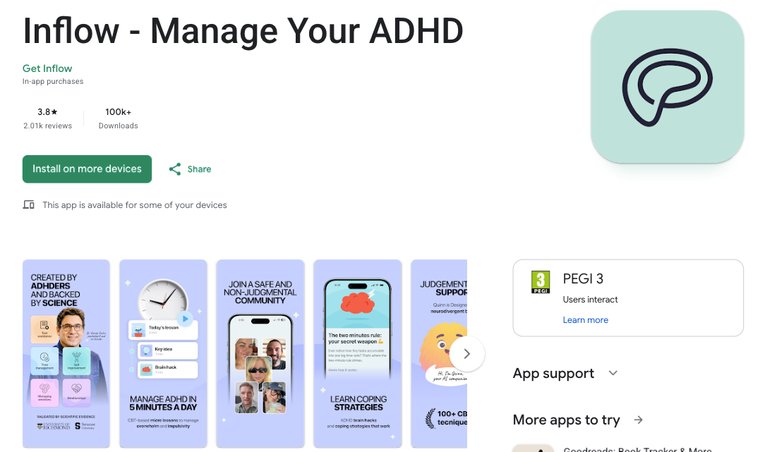
Every once in a while, I search for what products are getting funded and review different topics to get an analysis of the market and its trends. That's how I came across a product that I found fascinating, in fact, it's something I wish I had built myself: a mental health app for people with ADHD.
As someone with ADHD, I witness firsthand how some people go through completely different processes for tasks that might seem ordinary to others, often spending much more energy on things that are very simple for neurotypical people.
To give a very basic example: sometimes it feels like their brain is sprinting while they are just sitting still, trying to focus on a single task.
When I stumbled upon this product, I thought: "Awesome! If this actually works, it's worth buying." So, I downloaded the app to test it. And well, the reality was discouraging. Let me show you first.
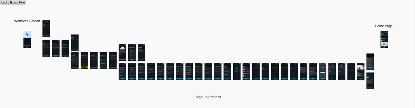
This is the login flow. Just the login. Meaning, as someone with ADHD, when I want to enter an app specifically designed for ADHDers, I have to go through 37 steps starting from the initial welcome screen, answering specialized questions and-answers, just to finally reach the home page and see what the app is actually about.
To be honest, if I hadn't been so curious about what these 37 steps were, I probably would have deleted the app by step 5. But not only the product, but this flow itself had become fascinating to me, so I took screenshots of the app and mapped out its flow.
This app is super interesting. There is a clinical team behind the solutions, and it has a specialized persona-driven approach. But why is it killing its user?
We have a special solution for our specific user, but the path wasn't designed for our user.
So let's analyze together how we can take this app with its brilliant idea and make it engaging for its end user as well.
Step 1: Who is my user?
This is the question we must ask ourselves before starting any design. What are the specific characteristics of the persona I am designing for?
For example, one of the common traits in individuals with ADHD, due to impairments in the dopaminergic reward pathway and the phenomenon of delay discounting, is that they experience a rapid drop in motivation during tasks that lack immediate rewards or engaging stimuli. Because of their aversion to delay, the rate of churn or abandoning these projects midway is significantly higher among them.
Now, let's re-examine that login flow. Was my design tailored correctly for my target persona?
Step 2: Psychological data collection vs. Trust
My next question: I am collecting psychological information from my user before final membership, right inside the onboarding process.
Does my user feel enough loyalty and security toward my product, and feel enough sense of need, to fill out this data?
Banking or government apps are things we already trust and need. But can a mental health app, which has many similar alternatives, gain my trust so deeply, make me feel it's unique, and convince me to input my psychological data into it before I've even seen the app environment or know how it works?
Step 3: Let's check the numbers
- Direct churn rate purely due to login: Digital identity verification industry data (such as data from IPification) shows that about 43% of users abandon the sign-up or login process halfway through, simply because they encounter barriers and friction at this stage.
- The bigger picture (Overall onboarding failure): Statistics show that the global average completion rate for login and initial setup flows in apps is only about 8 to 9%. This means more than 90% of users abandon the app before ever getting past this barrier.
Given this, I need to hook my user. I need to get them into the environment quickly, show them value, and make them want to spend more time in my app.
One of the methods to create this engagement for the user is showcasing the product's value propositions.
A product backed by a clinical team, where features aren't just copy-pasted from internet searches, but built by true experts, why shouldn't it highlight this unique and valuable proposition?
This is the winning card of this platform. With a bit of better design, it can create enough engagement to reduce this drop-off rate and even increase user retention within the app. In fact, this exact reason is why I got to know this app and installed it in the first place, so it is definitely a winning asset.
If I were designing the login flow
- First of all: On the welcome screen, instead of a generic cartoon illustration, I would feature a clear graphic related to the app's goal, paired with a short, punchy sentence highlighting the app's value proposition.
- Streamline the login process: Make it as fast as possible. This is why successful global platforms (like Duolingo or Spotify) have changed their structures: they defer the requirement to log in or sign up. They let the user experience the reward and interact with the app first (releasing dopamine), and after motivation is built, they ask them to register.
While I can't say from the outside what the absolute best method is, since we don't know the internal data and values of this specific app, decisions can be made based on them regarding how to collect this data later or summarize it.
However, if there is no hard structural requirement to collect this deep psychological data upfront, a much better placement would be after the user has seen the app and its value.
At the very least, we should definitely tell the user first that they can have a 7-day free trial, and if they want, take them in and gather data later, not the other way around.
Conclusion
“Successful businesses don't just have different solutions; they understand their user well, they understand the user's problem well, and they not only provide a specific solution but also build the path to reach that solution to complete the entire experience.”